Why Does My Colorful PFP Still Look Unclear at Small Sizes?
Profile pictures (PFPs) are a crucial part of your online identity, especially on platforms like Discord where avatars serve as your visual representation in chats, servers, and esports communities. You might have poured hours into crafting a colorful, detailed avatar, only to find when displayed at small sizes that it looks like a confusing blur. This can be frustrating — why does your vibrant, eye-catching PFP lose clarity and impact when shrunk down?
In this guide, I’ll explore the common pitfalls that cause colorful PFPs to become unclear, focusing on Discord’s interface and similar environments. I’ll unpack essential concepts like silhouette recognition, mobile-first readability, contrast hierarchy, and why faces and expressions matter. By the end, you’ll have actionable insights to improve your avatar’s clarity and make it pop on any device or screen size.
Understanding the Challenge: Small Size, Big Impact
Discord and many other community platforms often display avatars at very small sizes— anywhere from 40 pixels in chat lists to 128 pixels in profile previews, and sometimes even smaller on mobile devices. At these scales, details that look great on a desktop or large canvas simply vanish or create visual noise. Here is why:
- Pixel constraints: Small images have limited pixels to express details, so every element needs to be optimized.
- Multiple display modes: Profiles are viewed both in light and dark modes, which affects contrast and readability.
- Device variety: Smartphones have smaller screens and different display resolutions than desktops, impacting perceived clarity.
With these factors combined, a colorful PFP can look like a “blob” instead of a recognizable avatar — especially when it lacks a clear structural hierarchy or focal points.
Key Concepts to Improve Your PFP Clarity
1. Silhouette Recognition: The Power of Shape
One of the most overlooked but critical aspects of a great PFP is its silhouette — the avatar’s overall shape, particularly when rendered as a simple circle crop on Discord. Silhouette recognition refers to the ability of viewers to identify and differentiate an avatar purely based on its outline or shape, without relying on internal details.
Why does silhouette matter? Because at small sizes, internal details get lost, but the general shape can still create instant recognition. Good silhouettes have:
- Distinctive, clean shapes: Avoid overly busy edges or complicated forms that blend into the background.
- Strong separation from the background: The avatar’s outline should contrast against Discord’s primary backgrounds, both light and dark.
- Circle cropping consideration: Since most PFPs are shown with circle crops, test how the silhouette reads inside a circle. Your avatar’s design should work well within this frame.
To test your silhouette, load your avatar on a black and white background with a circle mask and see if it remains distinct without internal detail.
2. Mobile-First Readability: Thinking Small from the Start
I've seen this play out countless times: wished they had known this beforehand.. Discord usage skews heavily toward mobile users, and avatars need to be readable on small smartphone screens in both chat heads and server member lists. When designing or selecting a PFP, keep mobile-first readability in mind by:
- Testing at actual small sizes: Reduce your avatar in your image editor to 40px – 50px and check if it still looks clean and recognizable.
- Avoiding tiny text or fine lines: Text generally becomes unreadable below roughly 24px font size and cheapens the avatar’s clarity when shrunk.
- Prioritizing broad shapes over fine details: Simplify intricate patterns so they don’t become visual noise at smaller scales.
Remember, your avatar doesn’t need to tell a complex story at tiny sizes — it should convey a strong, immediate impression that hints at your identity or style.
3. Contrast and Separation: Building a Contrast Hierarchy
The equal intensity problem occurs when all the colors and elements of your avatar have similar brightness levels or saturation, creating a "flat" image with no clear focal point. This poor contrast hierarchy causes the avatar to blend into itself and its surroundings.
https://dlf-ne.org/why-do-subtle-expressions-fail-in-small-profile-icons/Contrast hierarchy refers to the deliberate use of light, mid-tone, and dark values to guide the viewer’s eye and create separation between important elements:
- Foreground vs. background: The avatar subject should stand out clearly from the background, either through different colors, brightness, or an outline.
- Element separation: Areas like hair, clothing, accessories, and facial features need sufficient contrast to avoid fusing into a confusing mass.
- Color choice: Use colors that contrast well in both light and dark modes — highly saturated or neon colors often “vibrate” and lose clarity when juxtaposed poorly.
Testing your avatar in both Discord’s light and dark modes is essential to ensure your contrast hierarchy holds up and your avatar remains legible.
4. Face and Expression Clarity: The Human Connection
Humans are hard-wired to recognize faces and expressions, which often form the most memorable part of an avatar or icon. Yet many colorful avatars falter here by cropping faces too tightly or including tiny, intricate facial details that vanish at small sizes.
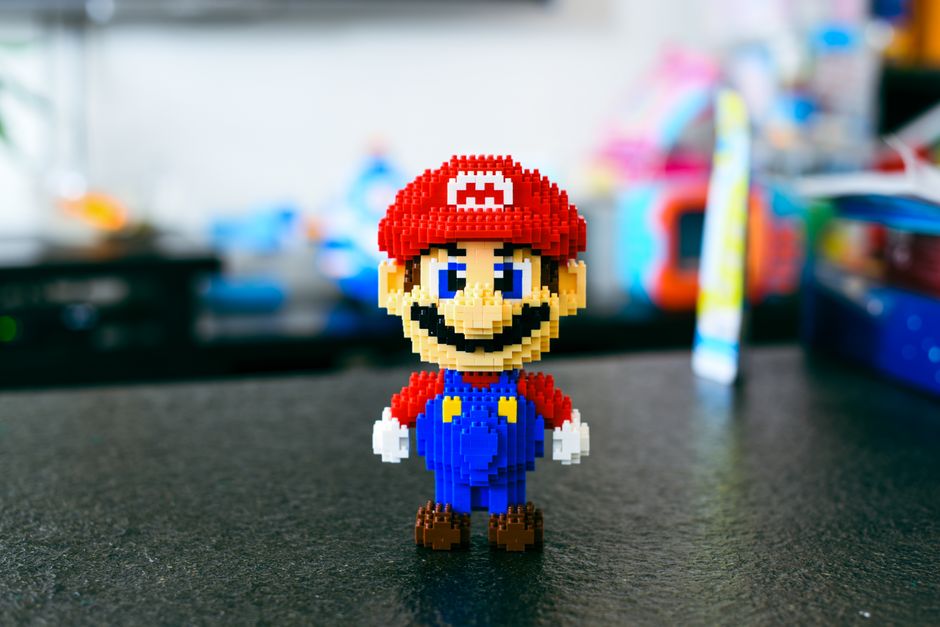
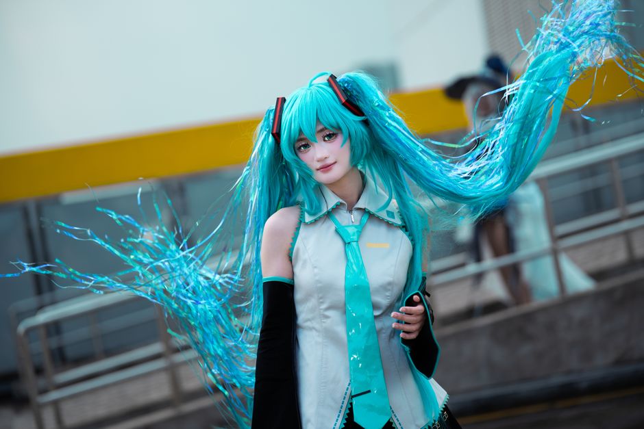
To maximize face and expression clarity:
- Crop with facial proportion in mind: Keep enough of the head and shoulders visible so the face isn't reduced to a dot.
- Exaggerate key features: Simplify and enlarge eyes, mouth, and key expression lines to communicate personality even in tiny pixel counts.
- Limit background noise: Busy backgrounds can distract from the face; choose clean or gradient backgrounds that improve separation.
Test your avatar on a small circle crop preview centered on the face — if you can’t see the expression clearly, the PFP will fail to connect on mobile or small desktop displays.
Tools and Tips for Testing PFP Clarity on Discord
After understanding these concepts, it’s time to test your avatar rigorously across real-world scenarios. Here are my favorite ways to ensure your PFP shines on Discord:
- https://highstylife.com/how-do-i-turn-a-detailed-game-artwork-into-a-clean-profile-icon/
- Circle Crop Preview: Use image editing software or avatar preview tools to crop your image within a circular mask and shrink it to 40-50px.
- Light and Dark Mode Mockups: Test your avatar on both white and black backgrounds that simulate Discord’s UI modes to verify contrast.
- Multiple Device Checks: View the avatar on your mobile phone, tablet, and desktop at native sizes to catch any issues common to specific devices.
- Avoid Text: If you must use text, keep it bold, large, and minimal — better yet, use symbols or icons that don’t rely on readability.
- Create a Personal Folder of Good Silhouettes: Store avatars you find clear and successful for reference and inspiration.
Summary Table: Clear vs. Problematic PFP Traits
Aspect Clear PFP Traits Problematic Traits Silhouette Distinct, simple shape; clear circle crop Busy, jagged edges; details lost in circle crop Readability Large shapes, no tiny text, mobile-focused testing Small text, cluttered details, no size testing Contrast Hierarchy Strong foreground/background separation, layered contrast Equal intensity colors, flat overall brightness Face & Expression Face clearly visible, expressive features emphasized Face cropped too small, subtle or detailed expression lostFinal Thoughts
You know what's funny? designing a colorful pfp that remains clear at small sizes on platforms like discord might seem tricky, but focusing on silhouette recognition, mobile-first readability, contrast hierarchy, and face clarity will guide you to success. Remember to constantly test your avatar at real display sizes and modes to refine your design. A PFP is often the first impression you make in any digital community — investing effort to make it distinct, readable, and expressive pays dividends in identity and recognition.
Keep these principles in mind, and your colorful PFP will stay sharp and impactful no matter how small it’s displayed.